Plot with SHAP#
Compute attributions with UnifiedIG; visualize them with SHAP. One conversion opens a familiar plotting workflow: explain an individual prediction with a waterfall, inspect a population with a beeswarm, rank contributions with a bar chart, or explore a feature with a scatter plot.
From explanation to plot#
Install the optional plotting dependency:
python -m pip install "unifiedig[shap]"
For an existing scalar tabular explanation, the entire transition is:
import shap

plot_values = explanation.to_shap()
shap.plots.waterfall(plot_values[0])
shap.plots.beeswarm(plot_values)
to_shap() creates a shap.Explanation carrying the calculated feature
contributions, baseline values, input data, and feature/output labels. It does
not run the model again or recompute the attributions. Keep the original
UnifiedIG result to inspect its completeness diagnostics and attribute_after
metadata, which are not carried into the SHAP container.
A complete example#
Fit a model, construct a calibrated reference distribution, explain held-out observations, and convert the result:
import numpy as np
import shap
from cbaseline import background
from sklearn.linear_model import Ridge

import unifiedig as uig

# Start explanation
rng = np.random.default_rng(17)
X = rng.normal(size=(180, 4))
y = 2 * X[:, 0] - X[:, 1] + 0.5 * X[:, 2]
model = Ridge(alpha=0.5).fit(X[:120], y[:120])
reference_predictions = model.predict(X[:120])
bg = background(
    predictions=reference_predictions,
    f0=float(reference_predictions.mean()),
    features=X[:120],
    weighting="calibrated",
)
result = uig.Explainer(model, bg)(X[120:])
plot_values = result.to_shap()
plot_values.feature_names = ["Feature A", "Feature B", "Feature C", "Feature D"]
The complete runnable script generates all four plots below. Feature names are assigned for this NumPy example; DataFrame column names are carried over by UnifiedIG automatically.
Waterfall: explain one observation#
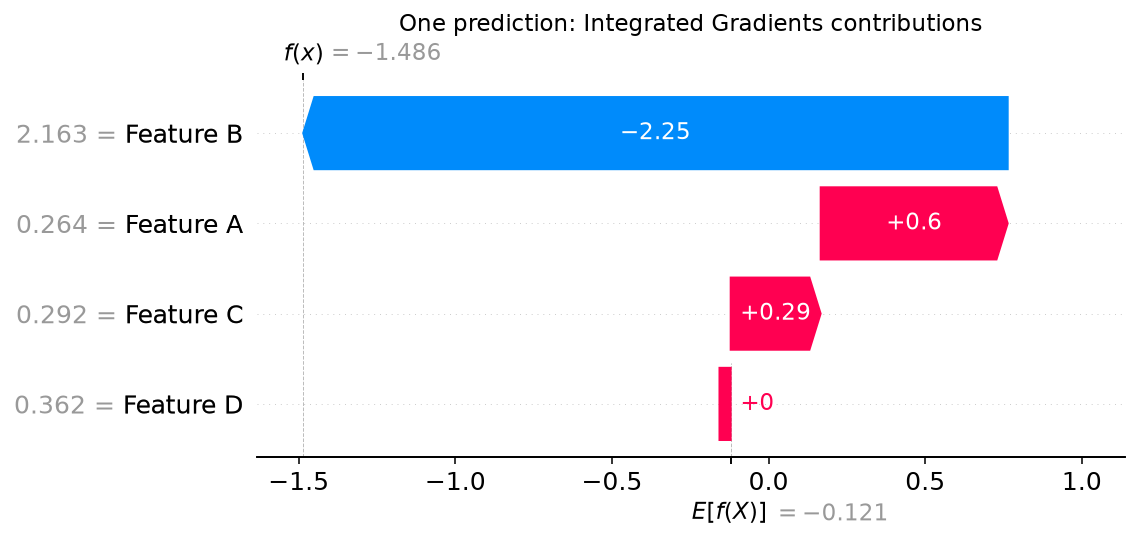
shap.plots.waterfall(plot_values[0])
Select one row. The plot starts at its baseline output and adds signed feature contributions to reach the model output. Contributions that raise the output point in one direction; those that lower it point in the other.
Beeswarm: inspect a population#
shap.plots.beeswarm(plot_values)
Pass all evaluation rows. Each point is an observation’s contribution for a feature; color represents the feature value. This shows the direction and spread of contributions across the population, beyond a single importance ranking.

Bar: rank contribution magnitudes#
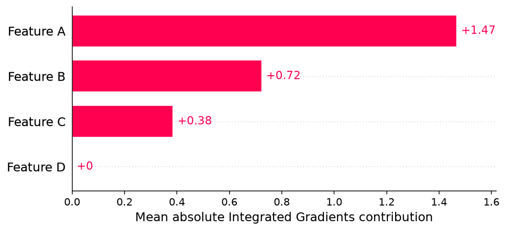
shap.plots.bar(plot_values)
For multiple rows, the default bar plot summarizes mean absolute contribution
per feature. It measures magnitude across these observations; signs are lost in
that aggregation. Pass plot_values[0] for a single-observation bar plot.
See SHAP’s bar API
for grouping and display options.
Scatter: relate a feature to its contribution#
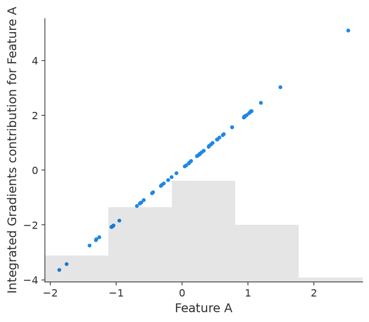
shap.plots.scatter(plot_values[:, "Feature A"])
Select one feature column. The horizontal axis shows its observed values and
the vertical axis shows its contributions. Optionally use
color=plot_values[:, "Feature B"] to color by a second feature. See
SHAP’s scatter API.
Multiclass and multiple outputs#
Waterfall and beeswarm examples above expect one scalar output. For a multiclass explanation, choose a meaningful pairwise score contrast first:
contrast = multiclass_result.contrast(0, 1)
plot_values = contrast.to_shap()
shap.plots.waterfall(plot_values[0])
shap.plots.beeswarm(plot_values)
This explains class 0’s score minus class 1’s score; integers are output
positions and strings can select output names. It requires no new model pass.
Alternatively, select one centered class coordinate or regression output from
the converted explanation with result.to_shap()[:, :, output_index] for
tabular data. That explains the selected coordinate, rather than a pairwise
contrast. See output interpretation.
Label and save the figures#
The values remain Integrated Gradients contributions. SHAP supplies the
plotting tools; the conversion does not make them Shapley values. Some SHAP
plot defaults label the axis “SHAP value.” For presentation, use show=False
and label the quantity explicitly before saving:
import matplotlib.pyplot as plt

shap.plots.beeswarm(plot_values, show=False)
plt.xlabel("Integrated Gradients contribution")
plt.savefig("ig-beeswarm.png", dpi=160, bbox_inches="tight")
plt.close()
For classification, the reconstructed output is a score or margin, not a
probability. For loss attribution, use the appropriate loss units. In the
alternative loss_reduction direction, ordinary additive waterfall endpoint
labels do not reconstruct endpoint loss; use the default loss_change
direction for a loss waterfall. See loss attribution.
The example gallery uses show=False and labels the figures as Integrated
Gradients. Reproduce it with:
python examples/shap_plotting.py --output-dir docs/_static/plots